Data analysis
練習專案五:大疫世代 3
數據可視化(Data Visualization)
概念驗證(Proof of Concept)
完整程式碼:proof_of_concept_map_line.py
-
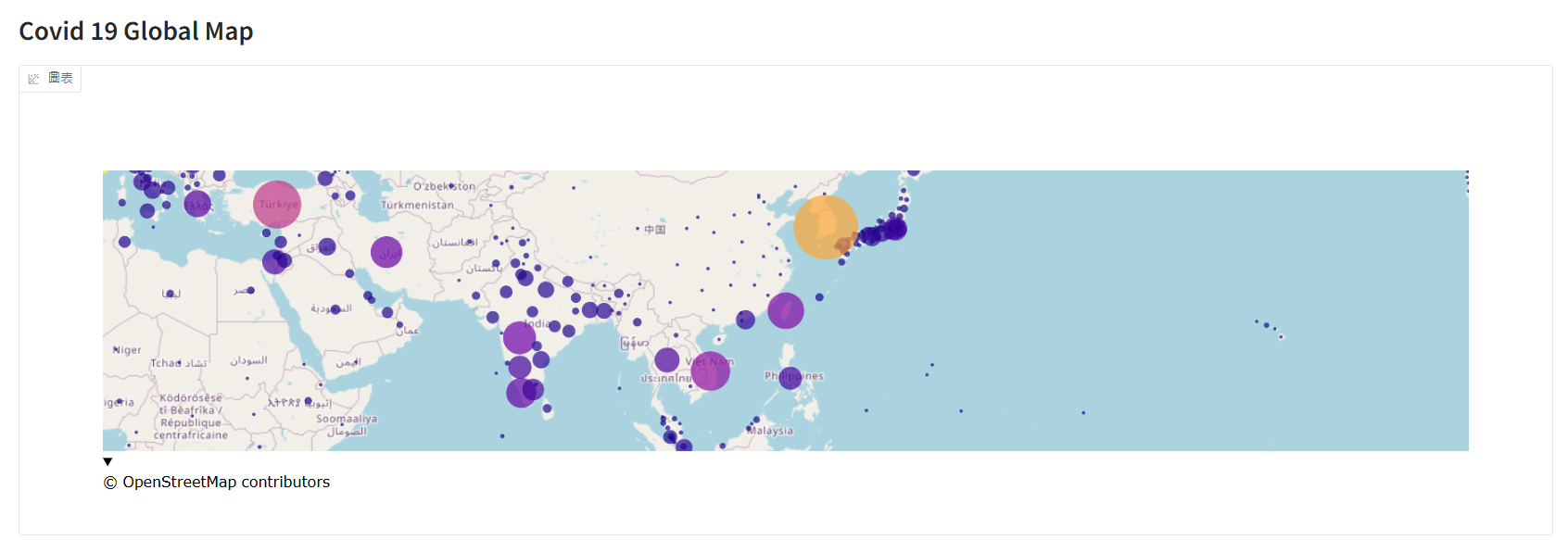
世界地圖: 本次課程上使用
Scattermapbox但即將淘汰,所以修改成建議的Scattermap取代。fig = go.Figure( go.Scattermap( lat=daily_report["latitude"], lon=daily_report["longitude"], mode="markers", marker=dict( size=daily_report["confirmed"], color=daily_report["confirmed"], sizemin=2, sizeref=max(daily_report["confirmed"].max(), 1) / 2500, # 調整氣泡大小比例尺 sizemode="area" ) ) ) fig.update_layout( map=dict( style="open-street-map", center=dict(lat=23.7, lon=121), # 地圖中心 zoom=2 # 初始化地圖大小,越小放越大(0=整個地球) ), ) # 佈置到 Gradio 中 with gr.Blocks() as demo: gr.Markdown("""# Covid 19 Global Map""") # 網頁名稱,沒有想是使用 Markdown 來顯示。 gr.Plot(fig) demo.launch()提示訊息:DeprecationWarning: scattermapbox is deprecated! Use scattermap instead. Learn more at: https://plotly.com/python/mapbox-to-maplibre/
-
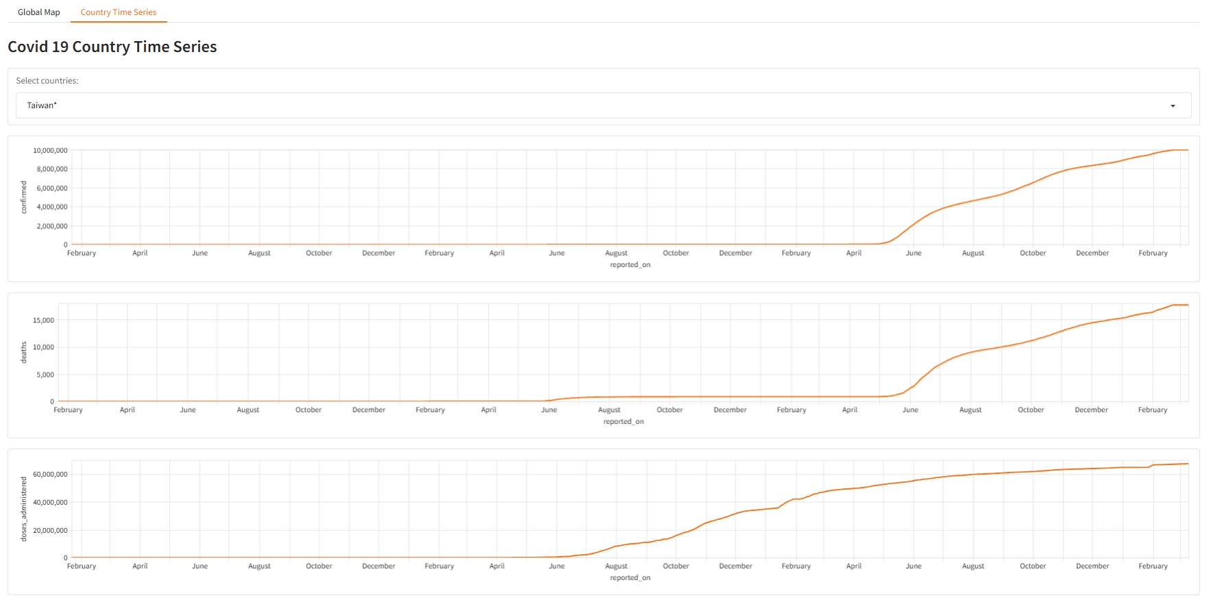
折線圖
time_series["reported_on"] = pd.to_datetime(time_series["reported_on"])
time_series = time_series[time_series['country'] == 'Taiwan*'] # 抓取台灣資料

with gr.Blocks() as demo:
    gr.Markdown("""# Covid 19 Country Time Series""")
    gr.LinePlot(time_series, x="reported_on", y="confirmed")
    gr.LinePlot(time_series, x="reported_on", y="deaths")
    gr.LinePlot(time_series, x="reported_on", y="doses_administered")
demo.launch()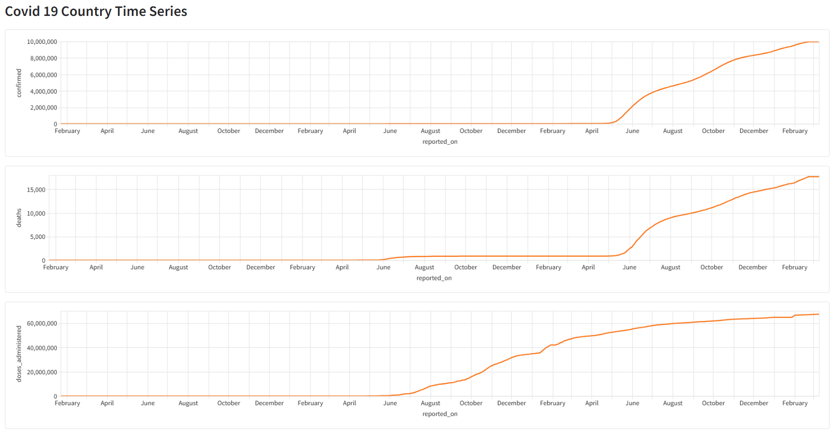
可視化成品(Final Visualization)
採用 Gradio 展示成品,使用 gr.TabbedInterface 結合世界地圖與折線圖。
- 成品參考:Huggingface。
- 完整程式碼:app.py
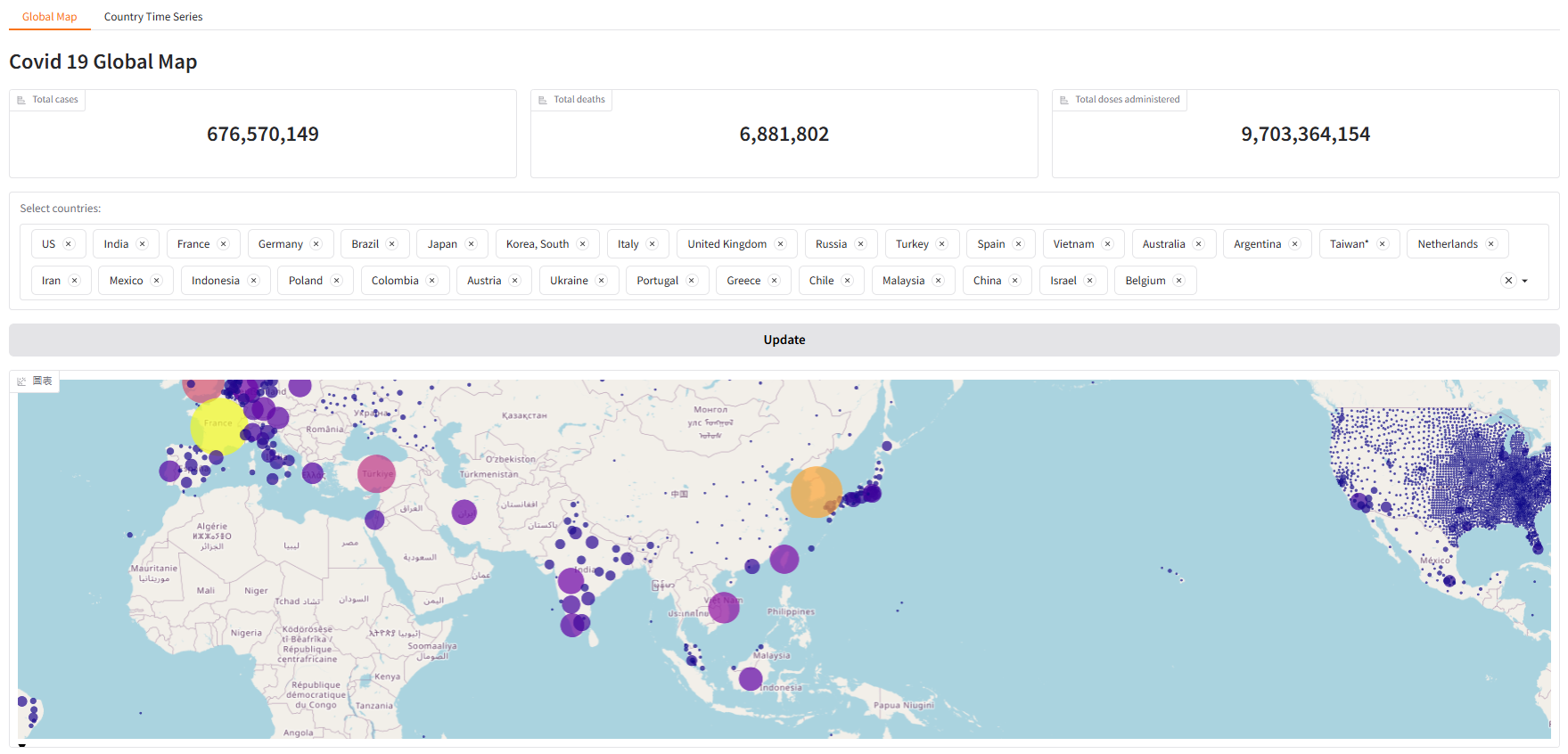
每日統計資料 - 地圖氣泡圖
-
地圖頁面:新增細節確診數、死亡數、疫苗數統計資料、篩選清單(預設為確診數前 30 國家) 與 更新按鈕。
# 氣泡資訊
self.daily_report["information_when_hovered"] = self.daily_report.apply(lambda x:self.format_hover_row(x), axis=1)

with gr.Blocks() as global_map_tab:
    gr.Markdown("""# Covid 19 Global Map""")

    # 新增:確診數、死亡數、疫苗數累積統計資料
    with gr.Row():
        gr.Label(value=f"{total_confirmed:,}", label="Total cases")
        gr.Label(value=f"{total_deaths:,}", label="Total deaths")
        gr.Label(value=f"{total_doses_administered:,}", label="Total doses administered")

    # 新增:各國篩選清單下拉選單
    with gr.Column():
        countries = gr.Dropdown(choices=self.daily_report["country"].drop_duplicates().tolist(),
                                label="Select countries:",
                                multiselect=True, # 開啟複選
                                value=top_confirmed) # 預設資料
        btn = gr.Button(value="Update") # 更新按鈕

    # 建立地圖框
    global_map = gr.Plot()

    # 預設資料
    global_map_tab.load(fn=self.filter_global_map,
                        inputs=countries,
                        outputs=global_map)

    # 按鈕:更新資料
    btn.click(fn=self.filter_global_map,
              inputs=countries,
              outputs=global_map)
-
地圖繪製:新增 氣泡資訊。調整 地圖邊界寬度。由於建立篩選功能,需要重新繪製地圖,所以須單獨建立函數,方便資料更新。
# 地圖繪製
def filter_global_map(self, country_names):
    filtered_daily_report = self.daily_report[self.daily_report["country"].isin(country_names)]
    fig = go.Figure(
        # Scattermapbox 即將淘汰,使用 Scattermap 取代。
        go.Scattermap(
            lat=filtered_daily_report["latitude"],
            lon=filtered_daily_report["longitude"],
            customdata=filtered_daily_report['information_when_hovered'], # 氣泡資訊
            hovertemplate="%{customdata}", # 文字樣式
            mode="markers",
            marker=dict(
                size=filtered_daily_report["confirmed"],
                color=filtered_daily_report["confirmed"],
                sizemin=2,
                sizeref=max(filtered_daily_report["confirmed"].max(), 1) / 2500,
                sizemode="area"
            )
        )
    )
    fig.update_layout(
                    margin=dict(l=10, r=10, t=10, b=10), # 調整地圖邊界寬度
                    map=dict(
                            style="open-street-map",
                            center=dict(lat=23.7, lon=121),  # 地圖中心
                            zoom=2                           # 初始化地圖大小,越小放越大(0=整個地球)
                        ),
                    )
    return fig
-
氣泡資訊處理:這邊使用
apply逐筆資料處理,但若資料規模超過十萬或百萬時,建議採用向量方式處理。- apply逐筆資料處理
def format_hover_row(self, df):
"""
建立地圖 hover 提示字串。
根據資料粒度決定不同格式:
- county 有值 → 顯示 (country, province, county)
- province 有值 → 顯示 (country, province)
- 只剩 country → 顯示 country
"""
if df.county != None:
    col = f"({df.country}, {df.province}, {df.county})"
elif df["province"] != None:
    col = f"({df.country}, {df.province})"
else :
    col = f"{df.country}"
return f"Location: {col}<br>Confirmed: {df.confirmed}<br>Deaths: {df.deaths}"
- 練習向量處理資料
# 資料處理 - 氣泡圖 hoverinfo。
def information_when_hovered_df(self):
    # 使用向量方法資料
    # 觀察 daily_report 資料後發現,1. country必定有資料、2. province有資料時,county不一定有資料、3.
    mask_county = self.daily_report['county'].notna()
    mask_province = self.daily_report['province'].notna() & self.daily_report['county'].isna()
    mask_country = self.daily_report['province'].isna() & self.daily_report['county'].isna()
    county_df = self.daily_report[mask_county].copy().astype(str)
    province_df = self.daily_report[mask_province].copy().astype(str)
    country_df = self.daily_report[mask_country].copy().astype(str)
    s_county = ("Location: ("
                + county_df['country'].str.cat(county_df[['province', 'county']], sep=', ')
                + ")<br>Confirmed: "
                + county_df['confirmed']
                + '<br>Deaths: '
                + county_df['deaths']).reindex(self.daily_report.index)
    s_province = ("Location: ("
                + province_df['country'].str.cat(province_df['province'], sep=', ')
                + ")<br>Confirmed: "
                + province_df['confirmed']
                + '<br>Deaths: '
                + province_df['deaths']).reindex(self.daily_report.index)
    s_country = ('Location: '
                + country_df['country']
                + "<br>Confirmed: "
                + country_df['confirmed']
                + '<br>Deaths: '
                + country_df['deaths']).reindex(self.daily_report.index)
    return np.select([mask_county, mask_province, mask_country],[s_county, s_province, s_country])
- apply逐筆資料處理
-
成品展示
各國時間序列資料 - 折線圖
新增 下拉選單,這邊有一個新的概念 裝飾器(decorator)。
def country_time_series_page(self):
    with gr.Blocks() as country_time_series_tab:
        gr.Markdown("""# Covid 19 Country Time Series""")

        # 新增:下拉選單
        with gr.Row():

            country = gr.Dropdown(choices=self.time_series["country"].unique().tolist(),
                        label="Select countries:",
                        value="Taiwan*")
        total_confimed = gr.LinePlot(self.time_series.head(), x="reported_on", y="confirmed")
        total_deaths = gr.LinePlot(self.time_series.head(), x="reported_on", y="deaths")
        total_doses_administered = gr.LinePlot(self.time_series.head(), x="reported_on", y="doses_administered")

        # 監聽使用者互動事件(切換 Dropdown 時)。
        # 在 5.x 新版 Gradio 元件會初始值 (value) 直接觸發綁定的函數(@gr.on),第一次載入頁面會自動觸發 @gr.on,所以即使沒有 country_time_series_tab.load 折線圖也能正常顯示。
        # 裝飾器: @gr.on 是個 decorator,它會把「下面定義的函數」自動註冊到這些 input/output 元件上。
        @gr.on(inputs=country, outputs=total_confimed)
        @gr.on(inputs=country, outputs=total_deaths)
        @gr.on(inputs=country, outputs=total_doses_administered)
        def filter_country(country):
            select_country_df = self.time_series[self.time_series["country"] == country]
            return select_country_df

    print("country_time_series_page pass")
    return country_time_series_tab
- 成品展示