Data analysis
練習專案一:復刻兩百個國家、兩百年、四分鐘 3
數據可視化(Data Visualization)
概念驗證(Proof of Concept)
-
載入環進載入模組、資料。
# 概念驗證 import sqlite3 import pandas as pd import matplotlib.pyplot as plt import matplotlib.animation as animation # 模組繪製動畫 connection = sqlite3.connect("Data/gapminder.db") plotting_df = pd.read_sql("""SELECT * FROM plotting;""", con=connection) connection.close() -
散步圖驗證
# 過濾出指定年份的數據
subset_df = plotting_df[plotting_df["dt_year"] == 2023]

# 取得各國的預期壽命、人均 GDP、以及所屬洲別
lex = subset_df["life_expectancy"].values  # 預期壽命 (Life Expectancy)
gdp_pcap = subset_df["gdp_per_capita"].values  # 人均 GDP
cont = subset_df["continent"].values  # 洲別 (Continent)

# 定義各洲的顏色對應
color_map = {
    "asia": "r",      # 亞洲 (紅色)
    "africa": "g",    # 非洲 (綠色)
    "europe": "b",    # 歐洲 (藍色)
    "americas": "c"   # 美洲 (青色)
}
# 建立畫布、散步圖。
fig, ax = plt.subplots()

# 依據每個國家的數據,繪製散點圖
for xi, yi, ci in zip(gdp_pcap, lex, cont):
    ax.scatter(xi, yi, color=color_map[ci])

# 設定圖表標題,顯示目前的年份
ax.set_title(f"The world in {year_to_plot}")

# 設定 X 軸與 Y 軸標籤
ax.set_xlabel("GDP Per Capita (in USD)")  # X 軸:人均 GDP(國際美元)
ax.set_ylabel("Life Expectancy")  # Y 軸:預期壽命(歲)

# 設定 Y 軸範圍(壽命 20-100 歲)
ax.set_ylim(20, 100)

# 設定 X 軸範圍(GDP 0-100,000 美元)
ax.set_xlim(0, 100000)
plt.show()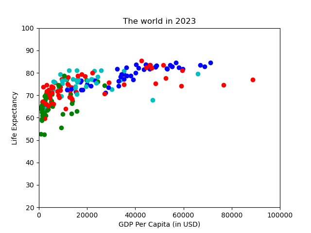
-
動畫驗證
# 包裝成圖表更新的函數
def update_plot(year_to_plot: int):
    # 清空畫布,確保每幀動畫不會疊加舊數據
    ax.clear()

    subset_df = plotting_df[plotting_df["dt_year"] == year_to_plot]

    lex = subset_df["life_expectancy"].values
    gdp_pcap = subset_df["gdp_per_capita"].values
    cont = subset_df["continent"].values

    color_map = {
        "asia": "r",
        "africa": "g",
        "europe": "b",
        "americas": "c"
    }
    for xi, yi, ci in zip(gdp_pcap, lex, cont):
        ax.scatter(xi, yi, color=color_map[ci])
    ax.set_title(f"The world in {year_to_plot}")
    ax.set_xlabel("GDP Per Capita (in USD)")
    ax.set_ylabel("Life Expectancy")
    ax.set_ylim(20, 100)
    ax.set_xlim(0, 100000)

# 建立動畫物件
ani = animation.FuncAnimation(
    fig,              # fig: 建立畫布物件
    func=update_plot, # func: 負責更新圖表的函數
    frames=range(2000, 2024),  # frames: 要傳入 func 的數列 (2000-2023)
    interval=10       # interval: 動畫間隔時間 (毫秒)
)

# 儲存動畫成 GIF 檔案
ani.save("proof_of_concept_animation.gif", fps=10)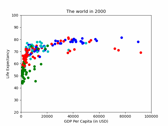
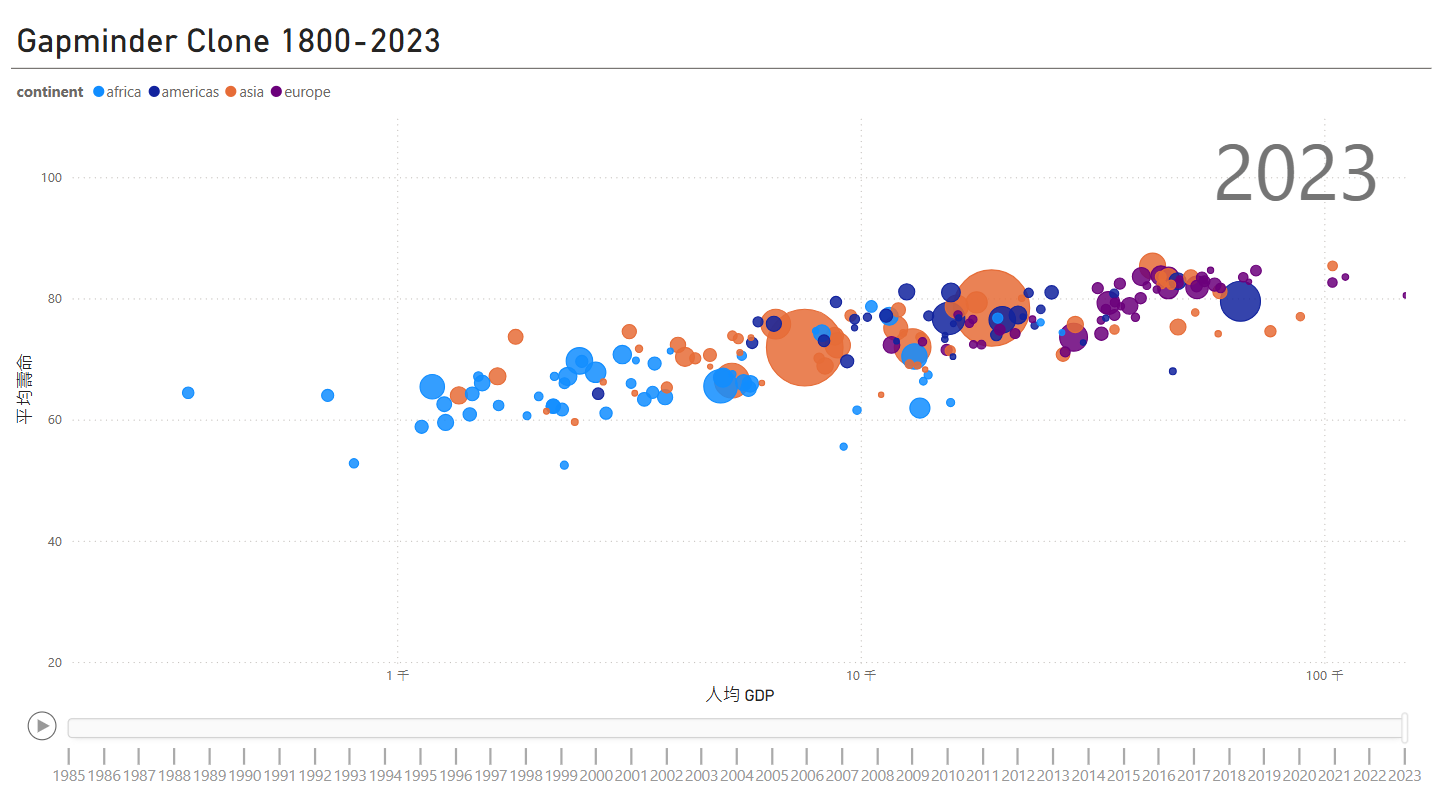
可視化成品(Final Visualization)
import sqlite3
import pandas as pd
import plotly.express as px

connection = sqlite3.connect("Data/gapminder.db")
plotting_df = pd.read_sql("""SELECT * FROM plotting;""", con=connection)
connection.close()

px.scatter(
    df,                               # 數據來源的 DataFrame
    x="gdp_per_capita",               # 設定 x 軸數據(人均 GDP)
    y="life_expectancy",              # 設定 y 軸數據(平均壽命)
    animation_frame="dt_year",        # 設定動畫的時間維度(年份)
    animation_group="country_name",   # 指定動畫中不同國家的數據追蹤
    size="population",                # 設定氣泡大小對應人口數量
    color="continent",                # 以洲別來區分顏色
    hover_name="country_name",        # 滑鼠懸停時顯示國家名稱
    size_max=100,                     # 設定氣泡的最大大小
    range_x=[500, 100000],            # 設定 x 軸的範圍(GDP 人均值範圍)
    range_y=[20, 90],                 # 設定 y 軸的範圍(預期壽命範圍)
    log_x=True,                       # 使 x 軸(GDP)以對數尺度顯示
    title="Gapminder Clone 1800-2023" # 設定圖表標題
)
fig.write_html("gapminder_clone.html", auto_open=True) # 儲存檔案
- 成品:上傳Github後就可以呈現了
- 成品:使用 Power BI 來完成。
- 為了達成 X 軸刻度顯示比較明顯, “log_x=True” 的效果 PowerBI 使用 “對數刻度” 來呈現。
- 為了達成 X 軸刻度顯示比較明顯, “log_x=True” 的效果 PowerBI 使用 “對數刻度” 來呈現。
注意:Power BI 只支援 正數 轉換為對數,因此數據不能包含 0 或負數,否則會導致錯誤,所以 X 軸最小值要設定大於1才能使用 。
備註(Notes)
ani.save()出現錯誤
>>> ani.save("animation.gif", fps=10)
MovieWriter ffmpeg unavailable; using Pillow instead.
解決方法:安裝 ffmpeg
conda install ffmpeg